Pepe Mar: Myth and Magic

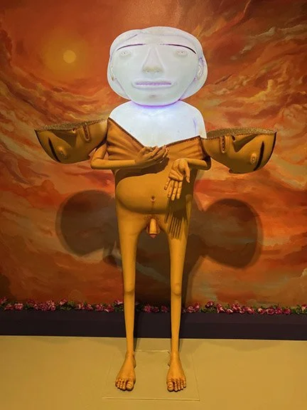
Visited this amazing show at the Tampa Museum Art. Pepe Mar’s: Myth and Magic represents the first survey of Pepe Mar’s art and highlights 15-years of the artist’s practice, from 2006 to 2023. Presented as a Gesamtkunstwerk, the exhibition itself has been conceptualized as an immersive artwork with the objects on view complemented by the artist’s vibrant fabric walls, plush poufs for sitting, and lush orange carpet. Each work is uniquely different yet incorporates Mar’s signature materials—such as paper cut-outs from magazines, catalogues, and books, decorative textile motifs, clay vessels and figurines, as well as found objects discovered by the artist in shops and thrift stores throughout the world.

Mar opens the exhibition with a sculpture garden and introduces the figure “Paprika,” the artist’s alter ego. Paprika anchors Mar’s work and represents the personal and the Other, as well as the fusion of medium and object. Loosely chronological, Pepe Mar: Myth and Magic is organized by concepts and processes present in Mar’s oeuvre: Assemblage, Revival and Mythologies, Face-Off, and Fabric Paintings. Assemblage examines personal and social identities as well as Queer aesthetics. Revival and Mythologies explores the artist as collector and ethnographer. In this section, the magnum opus The Cabinet of Dr. Mar highlights visual traditions and personal lore. The grid of collages entitled Face-Off illustrates Mar’s approach to portraiture, masking, and explorations of self. Fabric Paintings serve as an archive of the artist’s past works with sculptures, assemblages, and photographs transformed into colorful textiles.
Pepe Mar: Myth and Magic features 60 works of art from public and private collections across the United States, including Burning Up, a collage sculpture acquired by the Tampa Museum of Art in 2019 that served as the inspiration for this survey exhibition. The title of the exhibition pays homage to the 1979 exhibition of Mexican master painter Rufino Tamayo entitled Rufino Tamayo: Myth and Magic, organized by the Solomon R.Guggenheim Museum in New York City. While the works on view highlight Mar’s influences—art history, Mexican artifacts and architecture, fashion, science fiction, and pop culture—the exhibition also speaks to the artist’s biography. Living between the border of the US and Mexico, and later establishing roots in Miami, Florida, the art on view reveals the connections between self and site, and material as metaphor. As seen in Pepe Mar: Myth and Magic, the works from the past 15 years reflect the evolution of an artist, as well as a transformative return to his creative roots.

Barney Bubbles

Untold hero designer of the 70's/80's music world, was first blown away with his work on Hawkwind’s second album, that fold out sleeve was a glorious revelation, he had a unique vision that adapted to the changing world of music of those era's. But until the middle of the last decade the name Barney Bubbles wasn’t widely known or recognised aside from music business associates from back in the day or the odd rabid fan. The reason for this is not because his work was hidden away on obscure releases – he designed covers for several classic albums as well as a fair few hit singles in the 70’s and early 80’s. It wasn’t because the work wasn’t good, most of it is stunning, all the more so when you read into the detail he put in each and every one. It was more to do with the fact that Barney often didn’t sign much of his work, and when he did it was under some super-coded pseudonym only a few close to him would recognize. He also didn’t go out of his way to publicize himself and suffered from bouts of depression which, sadly, caused him to take his own life in 1983, thus halting what could have been a groundbreaking career in design.

I would say tBubbles was that rare thing in that he spanned two very distinct generations and worked seamlessly within both of them, a rarity these days and hard to pull off as most designers get associated with a particular style or genre and become known for that only. He started in the midst of the 60’s and became a full blown hippy, journeying to San Francisco in the summer of ’68 . He returned to produce graphics for the scene in London – the name Barney Bubbles was given to him after he started his own psychedelic light show mixing inks on overhead projectors. A long association with Hawkwind followed and he designed some of their most innovative sleeves such as ‘Space Ritual’ and ‘X In Search Of Space’ – both fold out wonders the likes of which were abundant in the 70’s.

But come the year of punk, when all this was to be washed away and the reset button pushed, Barney fell in with the newly hatched Stiff label with Ian Dury, Elvis Costello and Nick Lowe among others and seamlessly altered his style(s) to fit with the times, coasting through into the 80’s unscathed. He was the first person to mimic the Penguin book covers now so ubiquitous, parodied Blue Note sleeve design nearly a decade before it came back into fashion with Acid Jazz and took De Stijl and Cubist designs as inspiration before many others. He even dipped his toe into furniture design and early video promo making before he passed (did you know he directed The Specials‘Ghost Town’ video? no, me neither).

Elvis Costello Album Ad

Elvis Costello Album Ad

Elvis Costello Armed Forces Ad

Elvis Costello Armed Forces Ad

Oz Magazine layout 1968

Oz Magazine layout 1968

Ian Dury 4000 Weeks album cover

Ian Dury 4000 Weeks album cover

Hawkwind In Search of Space album cover

Hawkwind In Search of Space album cover

Hawkwind In Search of Space interior album cover

Hawkwind In Search of Space interior album cover

Damned Music for Pleasure cover and inner sleeve

Damned Music for Pleasure cover and inner sleeve

Ian Dury Songbook inner spread

Ian Dury Songbook inner spread

Ian Dury Songbook inner spread

Ian Dury Songbook inner spread

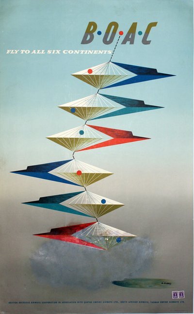
Abram Games surrealistic BOAC travel posters.

Came across these beautiful surrealistic representational travel posters by Abram Games illustrator/graphic artist. Born in Whitechapel, London, Abram Games became one of Britain's foremost graphic artists. Largely self-taught, Games opened his studio in 1936 and before the war, was already designing posters for major clients such as Shell, The London Transport and The National Post-Office. In 1942, he was appointed the "Official War Poster Designer" at the War Office, in which capacity he created more than 100 posters, and became the key person for British war communication. In post-war Britain, competition between the different airlines was fierce, and so, the airline companies hired the best graphic designers in the field, such as F.K. Henrion, Ashley Havinden, and Abram Games, to help them advertise. At the time when Games was creating a series of posters for B.O.A.C., the trend among artists was not to illustrate the actual airplanes (as had been the style in the thirties) but instead to advertise the advantages of flying, such as saved travel time. In order to capture these concepts, the designers created beautiful, symbolic and surrealistically-inspired images that quite poetically captured the abstract concepts they were advertising. Here, an elaborate weathervane seems to indicate the B.O.A.C. can take you to any of the 6 continents, or anywhere the wind blows. It is unclear precisely how many designs Games made for this series, but they are all united by a Surrealist feel and a pale blue and green background with faint clouds.

B.fly-boac-its-a-small-world-by-speedbird-31151-avion-vintage-poster.jpg.960x0_q85_upscale.jpg
D.BOAC-Far-Better-Travel-Poster.jpg
E.thumb809.jpg

OZ magazine

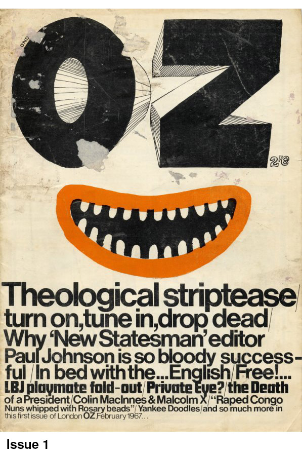
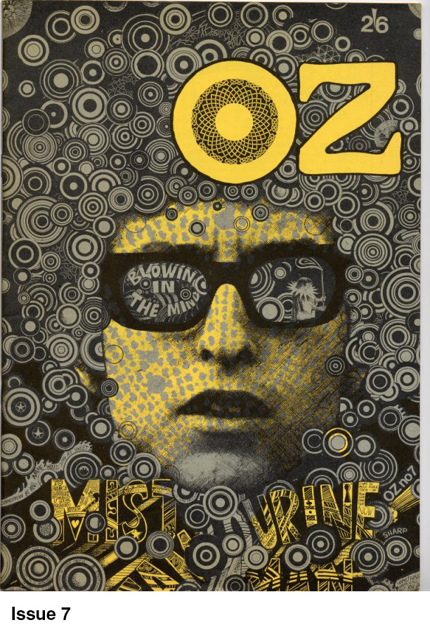
Oz Magazine, along with International Times was THE underground magazine during the late Sixties early seventies in England. Originating from Australia where it was founded by Richard Neville and Martin Sharp it came to England in February 1967 where the first issue hit the streets of an unsuspecting London. As a youngster just getting into art and graphics, the look and content of Oz was a huge influence .

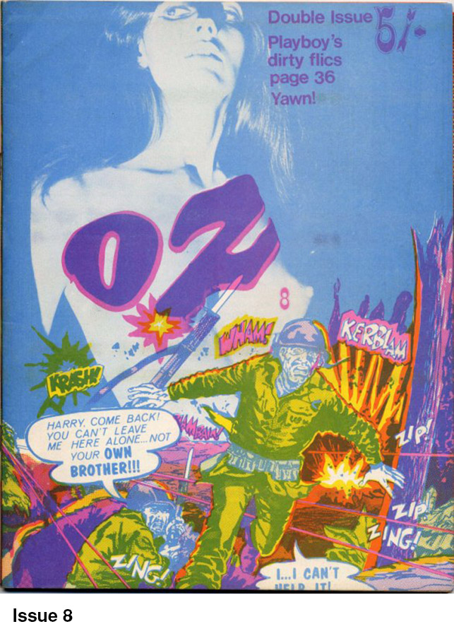
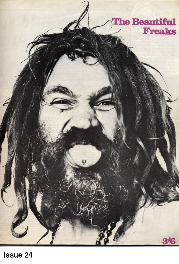
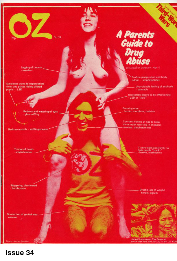
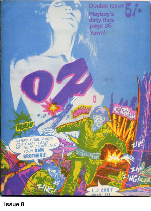
Oz ran for 48 issues and was printed in a variety of shapes and sizes during its time.

Misinterpreted by many as a 'Psychedelic' magazine, Oz actually had more in common with Private Eye being VERY anti-establishment but with its target audience firmly focused on the emerging underground scene it scored a massive hit. Until then there was only really the Indica Bookshop run by Miles for this kind of literature so it's success was virtually guaranteed.

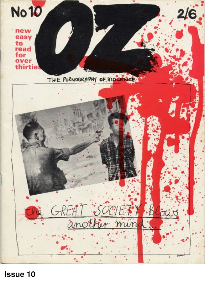
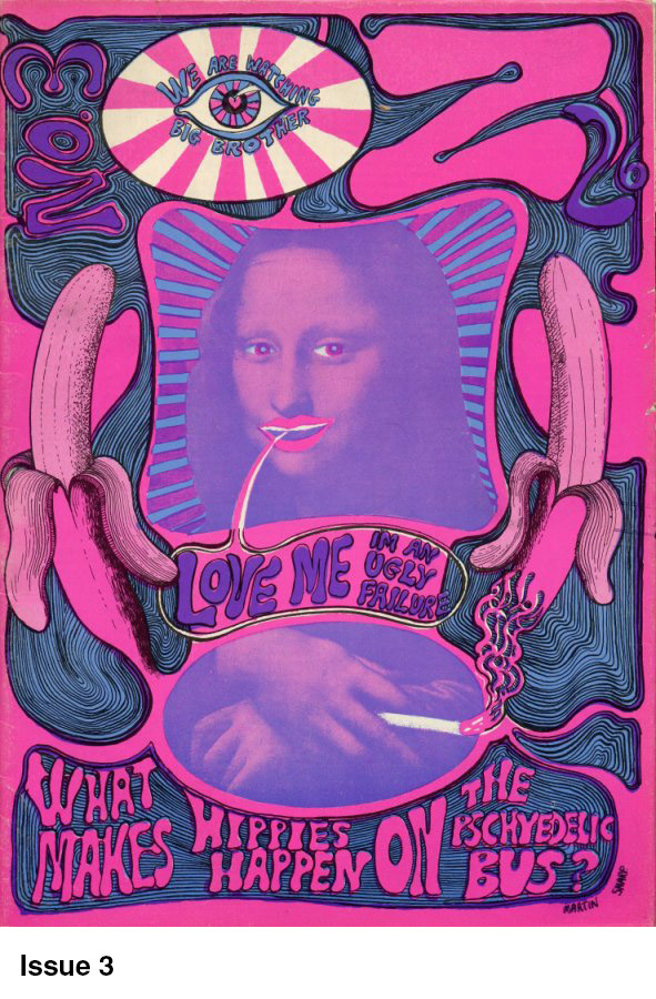
From the outset it was full of anger, radical ideas and left wing political ideals but by the time Issue No.3 arrived it was obviously becoming visually very psychedelic. Australian artist Martin Sharp had started experimenting with LSD and the stunning cover of Issue No.3 is testament to his new found influences featuring a joint smoking Mona Lisa and some very suggestive looking bananas!!

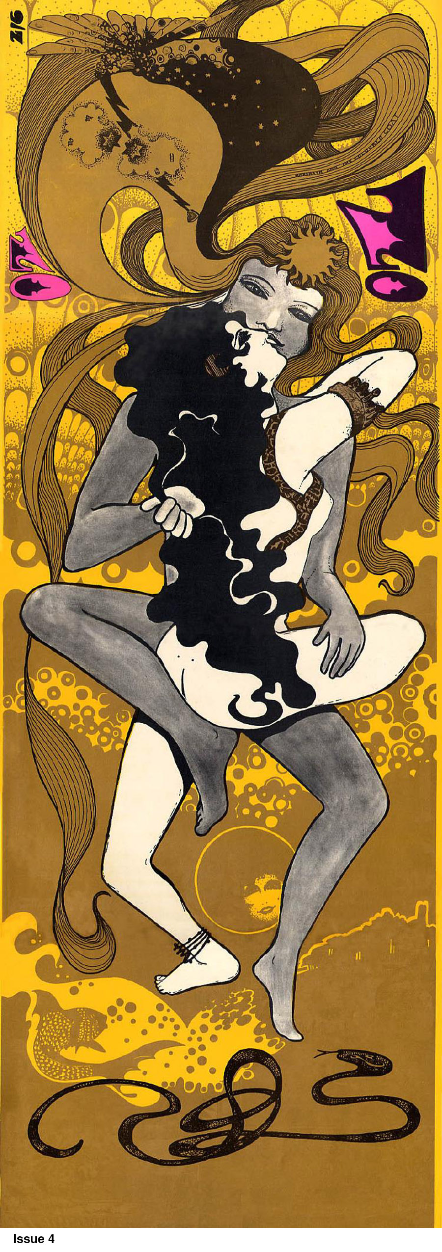
Issue No.4 featured superb artwork from one of London's finest, Hapsash and the Coloured Coat but perhaps the most famous cover of all was Martin Sharp's Bob Dylan cover for Issue No.7.

It was not all psychedelic beauty though, sometimes the covers were enough to stop you in your tracks as result of their powerful imagery (Issue No.10) or were just down right controversial (Issue No.25 and 28).

Anyway for your enjoyment we give you a visual feast in the form of cover art from the collection of Oz Magazine. ................enjoy!!


07_front copy.jpg
08_front copy.jpg
10_front copy.jpg
24_front copy.jpg
oz04cov copy.jpg